


Camille Przewodek brings plein-air oils to life through techniques learned from a true master
By Norman Kolpas
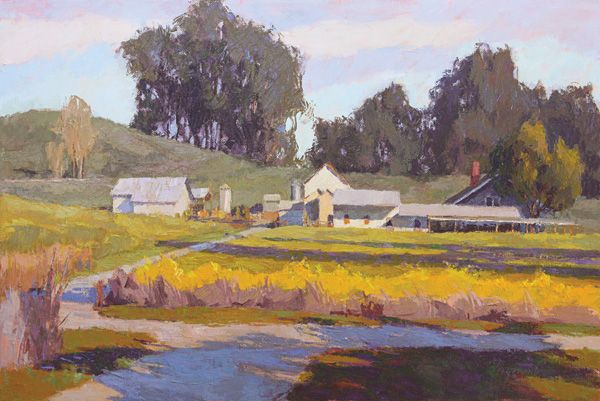
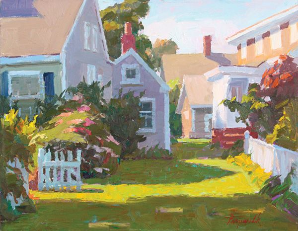
Camille Przewodek, Afternoon Mustard, oil, 24 x 36.
This story was featured in the June 2014 issue of Southwest Art magazine. Get the Southwest Art June 2014 print issue or digital download now–then subscribe to Southwest Art and never miss another story!
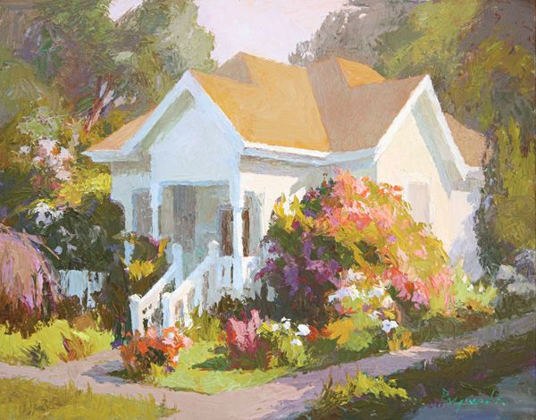
Should you come across Camille Przewodek, who wears a jaunty visor as she stands outdoors facing her easel, you are sure to find yourself drawn to the canvas on which she’s painting one of her favored subjects. These range from Northern California wetlands scenes like her piece COASTAL FOG to Oregon gardens bursting with blooms, such as FLOWERS AT SUNSET, to Victorian-era cottages surrounded by gardens like the one in WHITE ROSES, a scene not far from her home in the Sonoma County town of Petaluma.
But you may also find yourself drawn to the artist’s palette. On that palette, neatly organized on a gridded rectangle about the size and shape of an ice cube tray, you’ll see a dazzling spectrum of 27 different colors of oil paint squeezed out in stripes. Zesty-bright cadmium lemon adjoins more subdued cadmium yellow pale and deeper cadmium yellow. Looking as if it came straight off a traffic cone, cadmium orange yields to cadmium scarlet and then lipstick-toned Winsor red. Just a dab away are ketchup-y light red, burnt sienna resembling dried chili paste, cadmium deep red, and several other warm and earthy tones. Toward the cooler end, ochres and violets give way to five different greens, among them gemlike Winsor emerald and mysteriously dark viridian; and five different blues including deep cobalt and a Sèvres blue that evokes both the iconic French porcelain and an idyllic springtime sky.
“Paint technology is now getting to the point where we have all these great colors,” says Przewodek. “Yet, a lot of painters will say they use just a few and are proud of it. There is still this consensus that using too many colors is bad. I don’t get it.” In her view, the result of so many quality choices is that “you just have more options.” But, she cautions, “You also have to know what to do with them.”
Camille Przewodek, Corner of Light, oil, 11 x 14.
Przewodek has spent more than three decades assiduously learning what to do with colors, especially when she’s painting those she sees in the open air. She proudly describes herself as a “plein-air colorist,” which she defines by referring to a carefully considered explanation she crafted for her recently published book Mondays With Camille: Capturing the Key of Light in Color: “A plein-air colorist is someone who, in the representational tradition of Monet, is primarily focused on capturing the light key of nature. By light key, I mean the overall quality and effect of light on a subject.”
Her dedication to that approach—at once highly disciplined and also liberating in the powers it gives her to express what she sees—has led to widespread recognition as a highly respected plein-air painter. Since the mid-1990s, when she finally devoted herself full time to a fine-art career, she has been invited to take part in or juried into many major exhibitions nationwide. And her work has been recognized with some 20 awards, including, most recently, the Dickinson Signature Member Award from the American Impressionist Society in 2012.
Considering those achievements, it’s hard to imagine that Przewodek, now 67, was born into a working-class Detroit home that “was not an environment conducive to doing art,” she says. Her tool-and-die worker father and housewife mother were “just really hard workers” who lacked much of an aesthetic sensibility. Young Camille, by contrast, was always drawing and “would spend hours just kind of dreaming about things, and my mom would say, ‘Stop dreaming and pay attention.’” The teachers at the Catholic school she attended did nothing, she says, to remedy that lack of inspiration: “The school system wasn’t really geared toward my kind of learning.” Whether at home or in class, “I wasn’t encouraged to draw. Nobody gave me any art tools,” Przewodek says.
Fortunately, she had her brother Don, 12 years her senior. “He painted and had a studio in the basement,” she recalls. When he saw his little sister drawing with pencil and paper, he encouraged her, and he took her to visit the local art museum. “Other than my brother, I felt like I’d landed in the wrong house.”
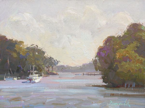
Camille Przewodek, Evening Boats, oil, 9 x 12.
Eventually, however, Przewodek’s natural talent and yearning for self- expression won out. After working as a secretary for a year after high school, she enrolled in midtown Detroit’s Wayne State University as a fine-art major. While earning her bachelor’s degree there, however, she experienced insufficient inspiration of a different sort. “There was no real instruction” in fine-art fundamentals, she says, noting that professor after professor delivered an aimless message—one that was widespread in art education during the 1970s: “Express yourselves,” they said. As a result, Przewodek sums up, “We were just throwing paint.”
After graduating, she moved to San Francisco and supported herself as a legal secretary while painting abstract works in her spare time. Eventually, though, her art felt uninspiring. “I reached a wall and had nowhere to take this,” she says. Realizing she was no longer looking at the world with a right-brained artist’s sensibility, she says, “I decided I was going to go back to school and study history and political science.” During her studies at the City College of San Francisco, from which she planned to transfer to UC Berkeley, she took a class in visual communications and, still in a more practical left-brain mode, she thought she might learn illustration “as a trade, and support myself with my art.”
She enrolled as an illustration student in San Francisco’s Academy of Art College (now Academy of Art University), from which she graduated in 1983. During her time there, however, a more important influence on her future career came to her through fellow student Dale Axelrod, whom she married in 1984.
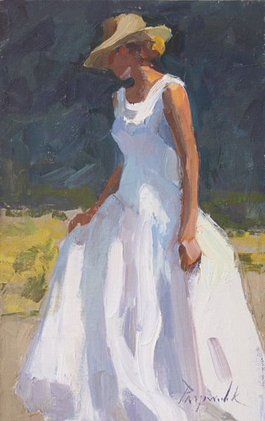
Camille Przewodek, Long White Dress, oil, 12 x 8.
In 1980 Axelrod invited her to join him at a summer workshop in Provincetown, MA, taught by the great plein-air colorist Henry Hensche, who was a student of and intellectual heir to the late, great American colorist Charles Webster Hawthorne. “It was like a religious experience,” she remembers. “I’d never been introduced to a master painter before. What Hensche was teaching was complicated. No one else was teaching it. I knew I couldn’t do what he was teaching, and it was going to take me years to get this, but I knew immediately that this was what I wanted.”
Hensche’s process started with having students create outdoor, sunlit studies of colored blocks by applying oils using painting knives, a straightforward way to learn how to model forms through subtle color changes—in simplified terms, the foundation for the “light key” approach that Przewodek still uses. With practice and experience, such light-key modeling becomes more and more refined, progressing from simple blocks to more complex still lifes to, eventually, depictions of the natural world brought to vibrant life through minute variations and juxtapositions of color.
Przewodek kept returning to Provincetown through 1985 to study with Hensche. And, though he died in 1992 at the age of almost 92, to this day she still thinks and speaks of herself as his student. His teachings literally changed the way she sees and continues to depict the world around her.
Straight out of the Academy of Art College, Przewodek’s plein-air colorist approach began to earn her work as a fine-art illustrator. She painted a double-page Alfa Romeo car ad that was published nationally in top venues like Time and Newsweek magazines and The New York Times. Many more coveted assignments followed, ranging from a Mother’s Day campaign for Target stores to the respected Sonoma winery Chateau St. Jean.
A decade after her graduation, however, Przewodek’s work began to be affected by the digital revolution. “Art directors were starting to do designs on the computer,” she says. “So, one day in 1996, I literally got up and said, ‘There’s no money, and I don’t want to do this anymore.’”
Camille Przewodek, Provincetown, Gateway to Light, oil, 11 x 14.
The very next day, she toted her easel, canvas, and oils out onto the streets of Petaluma’s historic downtown to paint a building she admired. While she was at work, a man came up to her and asked if she’d do a painting for him of his home, which had been designed by the great architect Julia Morgan, best known for the monumental Hearst Castle on the central California coast. They agreed on a price for the commission, and she concludes, “On my first day, I made twelve hundred dollars.”
Always an astute businesswoman, Przewodek immediately “transferred my substantial illustration advertising budget into fine art,” holding open studios and running ads in art magazines. She also began teaching her widely popular classes and workshops, which now include Monday morning colorist sessions, plein-air events near her studio along the west side of the Petaluma River, Friday morning figure classes, and other gatherings held regularly across the country. “I’m passing on the Hensche tradition,” she says, summing it all up.
And, of course, whether teaching or out and about on her own, she’s always painting—and learning. “I’ve been working on color for 30 years now, and most of the time I still feel like I’m a beginner,” she says. As much as possible, that painting and learning happens outdoors, though she will occasionally move inside. “My true love is being on location,” she says, going on to quote the great Spanish painter Joaquín Sorolla. “He said, ‘As far as outdoor work is concerned, a studio is only a garage; a place in which to store pictures and repair them, never a place in which to paint them.’ I don’t adhere to that completely, but I resonate with it.”
Przewodek’s outdoor approach even extends to the figurative work on which she’s recently begun to spend more time, with the goal of producing larger, museum-quality paintings. “I don’t know what they’re going to look like yet,” she admits, since “people know me for landscape.” Still, she adds with a modest laugh, “I’ve never really painted to sell. I just keep filling in the holes of my education. And my clients have come along with me.”
representation
Galerie on Broad, Charleston, SC; Knowlton Gallery, Lodi, CA; Studio B Gallery, Easton, MD.
Featured in the June 2014 issue of Southwest Art magazine–click below to purchase:
Southwest Art June 2014 print issue or digital download Or subscribe to Southwest Art and never miss a story!


MORE RESOURCES FOR ART COLLECTORS & ENTHUSIASTS
• Subscribe to Southwest Art magazine
• Learn how to paint & how to draw with downloads, books, videos & more from North Light Shop
• Sign up for your Southwest Art email newsletter & download a FREE ebook
Pingback: Camille Przewodek – Artists and Artisans | gkaplanphotography.com